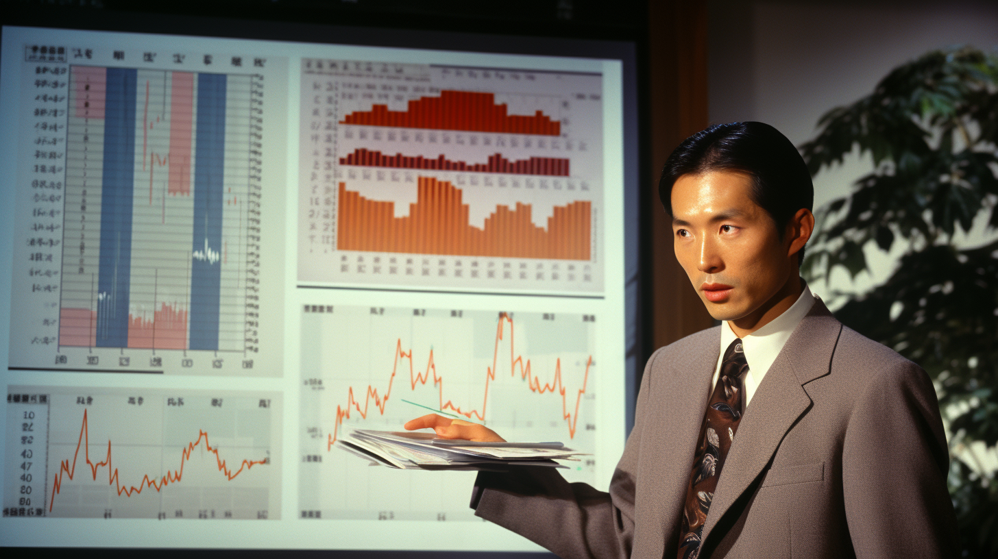
Ever sat through a presentation and felt like you’ve been transported into a children’s cartoon episode? Well, if you’ve had the pleasure (or bemusement) of viewing some of Japan’s corporate and government presentations, you might just get that vibe. With their vivid colors, quirky animations, and sometimes cartoonish designs, these presentations might make you momentarily wonder if you’ve stepped into a Saturday morning kids’ show instead of a serious boardroom meeting.
But chuckles aside, there’s a historical context behind this. Historically, Japanese culture has always put immense value on storytelling, with ancient customs like “Kamishibai” – a form of street theatre and storytelling that dates back to the 12th century.
Here’s a video on YouTube, if you are interested:
These narrative traditions have made their mark on corporate Japan as well, with an emphasis on in-depth, comprehensive details. The transition from oral storytelling to visual presentations was a natural progression. When PowerPoint emerged in the late 20th century, it was adopted eagerly, becoming a mainstay in corporate boardrooms, Government agencies and even media networks.
Talking about media networks, I must mention the classic “Terebi furippu” (Television Flip) boards used for decades on Japanese TV. The usual setting comprises of some members participating in a “panel discussion” and a lot of the key talking points or findings are put up on a paper board (see the sample image). This is no ordinary board, mind you! It’s a work of creative, chaotic, madness that can only make sense in Japan! 🙂 As the discussion progresses, a removable covering sticker is peeled off dramatically by the presenter from the relevant section of the board to reveal the contents beneath! You must see it to believe it! I tell you, when I saw this for the first time on TV, I was simultaneously in awe of the people who put these boards together and also lost my mind thinking about why anyone would even consider using something as primitive as this! The obscene amounts of paper and ink that would go into creating hundreds of thousands of such boards was no laughing matter… but then, this is Japan at its curiously weirdest! 🙂
For many years, the dense and detail-oriented style of presentations in Japan, whether in board meetings, government briefings, or news bulletins, was a reflection of the culture’s emphasis on thoroughness and precision. It was more than just conveying data; it was about painting the entire picture, ensuring no stroke was missed.
Fast forward to today. While corporate sectors globally have been revising and updating their presentation styles, many sectors in Japan, including government agencies and media networks, have retained the 1990s flair. The extensive use of text blocks, an avalanche of bullet points, and visuals that hark back to a bygone era are still prevalent.
Now, this isn’t just a quirky throwback. It poses challenges. In an age of information overload, where audiences are inundated with data from all sides, clarity and engagement are more crucial than ever. When a government agency releases a data-heavy presentation, the risk runs high of essential details getting lost in the clutter. Similarly, when media networks use outdated presentation styles, the core message might get overshadowed by the cacophony of information.
The global trend leans towards sleek, minimalistic, and story-driven presentations. This shift isn’t just aesthetic; it’s rooted in the understanding that today’s audience, whether stakeholders, citizens, or viewers, value clarity and brevity. They appreciate being guided through a narrative, rather than being left to wade through a sea of data.
So, where does Japan go from here, especially given its rich tradition and emphasis on detail?
- Embrace the “Zen” Aesthetic: Japan has always been the torchbearer of the “less is more” philosophy, seen in its Zen gardens and minimalist art. This can be translated into presentations too. Simplify slides, emphasizing core messages, and use whitespace generously.
- Modernize with Technology: New tools allow for interactive elements, dynamic graphics, and animations. Instead of static slides, why not incorporate a short video clip or an interactive poll?
- Re-Engage with Storytelling: Drawing from its Kamishibai roots, presentations can be structured as stories, starting with an introduction, building up to a climax, and ending with a strong conclusion.
- Training and Workshops: For both corporate sectors and government bodies, workshops focusing on modern presentation skills can be a gamechanger. It’s about equipping teams with the right tools and know-how.
- Consistency is Key: Whether it’s a government briefing or a corporate presentation, maintaining a consistent visual theme that resonates with the brand or department’s ethos can add a layer of professionalism and coherence.
In conclusion, while Japan’s approach to presentations has deep historical roots, there’s a pressing need to evolve and align with global trends. This is not about discarding tradition, but about amalgamating the old with the new. It’s about ensuring that the rich details and nuances that Japan is celebrated for are conveyed in a manner that’s clear, engaging, and relevant in today’s fast-paced world. After all, in the dance of tradition and modernity, Japan has always known the steps. Now, it’s just about tweaking the choreography a bit. 🙂
Ani

